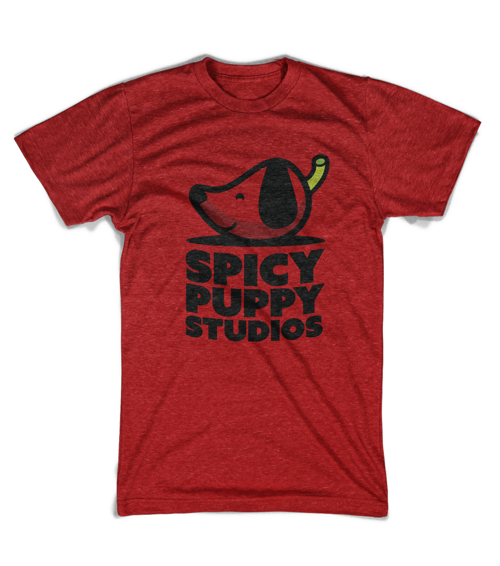
Spicy Puppy Studios is a brand new music production conglomerate specializing in audio production for film, television, worship, with 5.1-7.1 surround sound and spacialization capabilities.
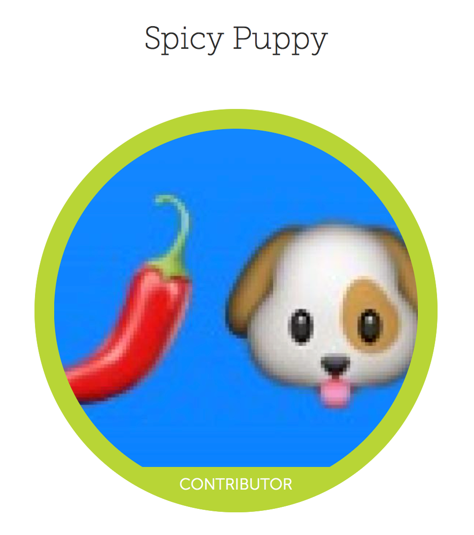
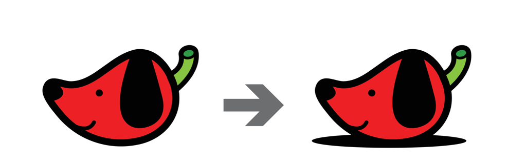
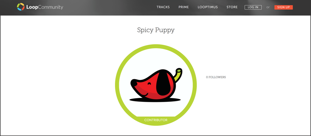
Mark, the owner/founder of Spicy Puppy Studios, needed some help with his logo…here it is as it existed on LoopCommunity.com
So, he knew exactly what he wanted his new, non-emojified logo to be…”What if it was a puppy with a pepper head? You know…you know how a puppy’s head looks kinda like a pepper?” Hmmmm. I was up for the challenge. I mean, I’ve made a mountainous sunset out of a tooth, so I can swing a puppy-headed pepper!
Obviously, when a client has a firm grasp on what they are wanting in a logo, it cuts out some otherwise critical pieces of certain steps in the development process. The amount of research needed is cut considerably because instead of coming up with a logo from scratch, there’s a base there from which to work. And it’s already something the client is passionate about. This is usually a good place to be…unless the client’s idea is less than favorable. You know, as in, it’s just not a good idear. Then, it’s important to convince them otherwise and come up with something that will serve them better. (How exactly that is done is an entirely separate post…I’ll file that one away for later.)
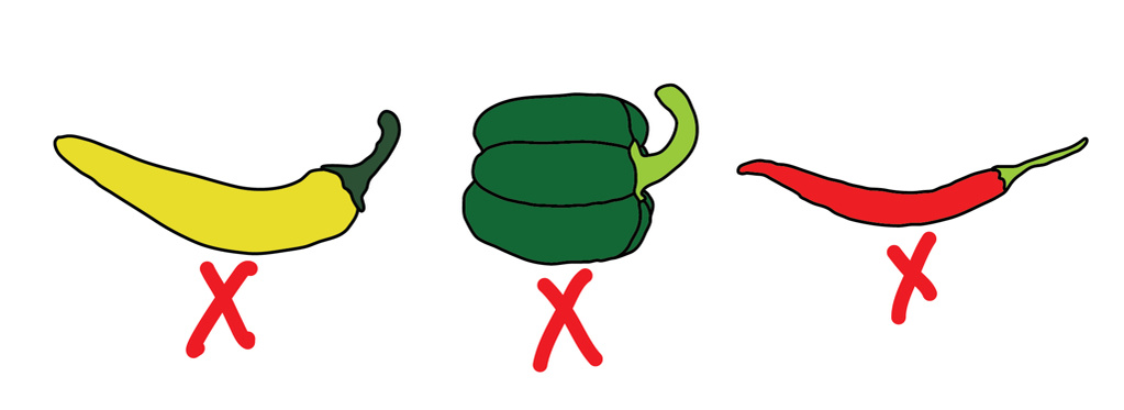
So, my base with Spicy Puppy was a puppy head resembling a pepper. That’s already super fun. Right? Let’s keep it here. No need to change anything. But not a banana pepper (too fat and long…plus, it’s not spicy). And not a bell pepper (too short and fat…again, not spicy). Not even a chili pepper (too skinny and long).
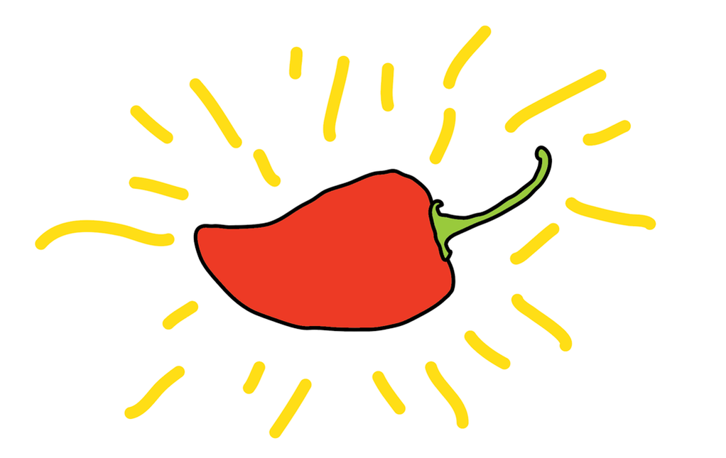
Habanero…thaaaaat’s the pepper we’re looking for here. (So, I did have to do a little pepper research…and some puppy head research.)
I’m not an illustrator (as evident in those pepper tracings you just witnessed). I don’t even play one on T.V. When I have illustration needs, I hire my illustrator buddies. (#AlwaysSupportYourBuddies) But, simple illustrations, shapes and stuff, I can usually hang. And if I get in a bind, I call in the big guns. For puppy-pepper-head, though, I worked it out myself. I did it, Mom!
So in the initial stages, I thought he’d end up with a body to go along with his cute little head. But after getting into it, and knowing that the head would have to translate as a head while also translating as a pepper, attaching it to a body just seemed superfluous and confusing. But, I also couldn’t have it looking like a floating head. After tossing around some options, I decided to use a shadow of sorts to anchor him.
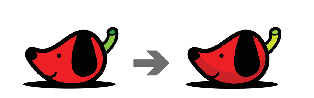
Since this logo will be used on the web 99% of the time, and most probably never embroidered, I decided to add a subtle shadow along the bottom of his head/pepper for some visual interest. And since it’s mostly used on Loop Community, I changed the green on the stem to match the green that Loop Community uses on their logo-encompassing-circle.
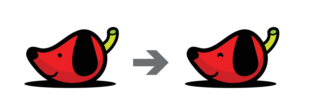
And Mark suggested making his eye a bit “cuter” and less “beady”.
Boom. That made it!
While there are no plans for an apparel line just yet, I think it’d make for some pretty sweet swag!
“I absolutely LOVE my Spicy Puppy logo! Carla took the time to get to know my target audience and my needs, and the spirit of my company. She supplied us with all the formats we needed and even did a little education, explaining the application of each format. Well done!”
- Mark E., Owner/Founder of Spicy Puppy Studios
So, last week obviously didn’t start out as I had planned. (This can happen from time-to-time, yeah? Yurp.) So, long-funny-story short, I got my very own ambulance ride to the hospital around 3am last Tuesday morning. (Just a heads up. They’ll take you there when you complain of chest pain in addition to numerous textbook heart attack symptoms such as pain in your neck, shoulders, arms, back; nausea; cold sweats; feeling faint; uncomfortable breathing; etc.)
I was released a few hours later when all the blood work, chest x-rays, and EKGs came back clear.
“Everything is fine with your heart. It looks GREAT, actually.”
Whew.
“Inflamed Chest Cartilage” was to blame for my little “episode”. It’s something that I’ve been aware of for the past couple of years, but it’s never presented itself in “attack” form…ever. Lawzie. So…that was weird. Crazy weird. But I’ll know for next time to just wait 8 minutes and pop 800mg of Motrin instead of having Matty call the bus, and giving him a heart attack in the process. Wacka wacka.
That little venture Tuesday morning threw my entire week off. I was fatigued all week, missed my morning workouts, and just couldn’t seem to get it together, in general. My week was severely thrown off-kilter.
And I hate it when that happens.
But… sometimes, when things don’t go as planned, it opens us up to allow opportunity for better things to happen.
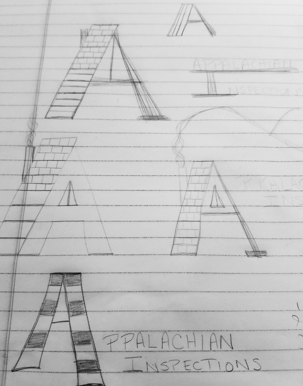
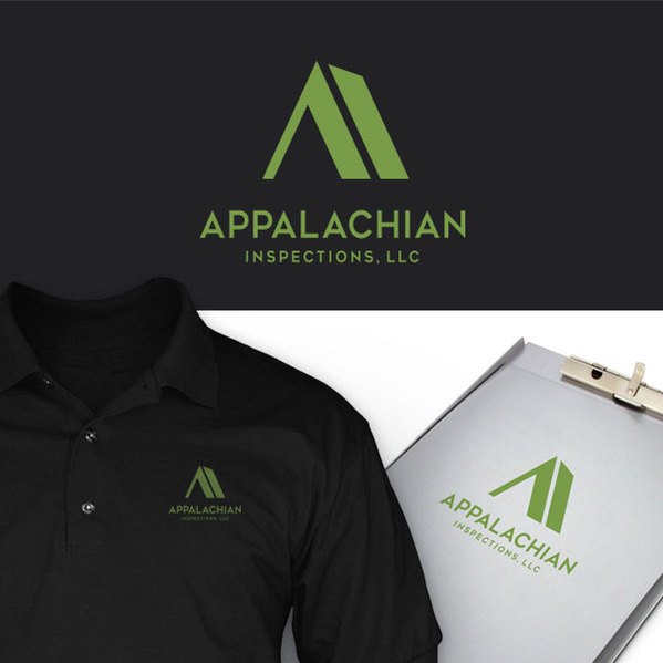
This often occurs as I work through logo projects with clients. Last year, I knocked out a logo for my friend, Carrie. This year, her husband, Chris, contacted me about doing a logo for his new home inspections business, Appalachian Inspections, in Western North Carolina. I love Carrie…I love Western North Carolina…so I figured Chris and I would hit it off just fine with his project.
Chris had a working idea of what he was wanting in a mark for his business. He had sketched out a few ideas, but just couldn’t land on anything he liked…
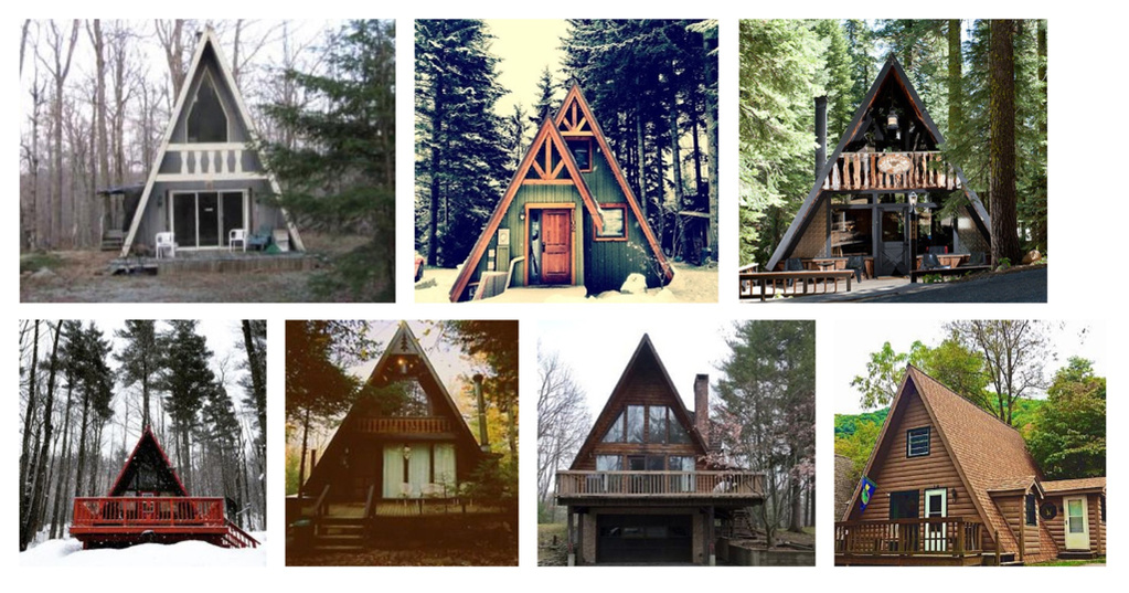
He knew he wanted an “A” to be represented. He thought working it into replacing the “A” in “Appalachian” could possibly be a solution. He also liked the idea of working an A-frame house into the “A” since A-frame houses are prevalent in Western North Carolina. I was diggin’ this idea of his. (A-frame houses are cool, y’all. I never really paid much attention to them, but I think, like anything else, they just have to be given a fair chance to make their statement in the world. That’s right. Look at that green one! Mmmmm.)
So, let’s sit here for a minute. Most often, allowing a letter to be the mark (symbol) in a logotype (word in the logo) is not a favorable solution. It can be messy and can lose it’s luster on a small scale. It also locks the client into having to use a logo that doesn’t have a stand-alone mark. It always has to be supported by the logotype when used in any application. This can present problems at times. But…there are times when it can work, and work well. But in those cases, the logotype is usually short in length.
See? They’re short. So, they work. Imagine a long word, let’s say “Appalachian”, for instance, on a business card…and the “A” is a symbol such as a house. (Okay, okay…an A-frame house since we’re here.) Of course, as the word shrinks in size to fit on the card, the symbol (the “A”) must shrink proportionally. Uh oh…now we have a mess. And when we hand over our fancy new biz card to a potential client, they’re going to be holding it at arm’s length (if they’re approaching 40 or already over it), or smooshing it up to their face (if they’re a young whipper-snapper) as they strain and try to figure out what exactly they are seeing on that “A”. That’s embarrassing. No one has time for that in their lives. And whether he had time for it or not, I didn’t want Chris to have to deal with a logo that was going to treat him poorly. Logos should always treat people nice. Yeah, they should.
So, instead, I worked with the “A” and the “I” together to create a monogram for “Appalachian Inspections”, but still gave the shape the necessary treatment to subtly resemble an A-frame structure. Chris was very pleased with the result and is now happy to present his business card to anyone…anyone under the age of 40, or over the age of 40.
I love making people happy. It’s a great, great thing to do. It’s especially fun and rewarding when the outcome is so much more than what they imagined when they started those first initial sketches during their planning phase.
So, don’t be bummed the next time your plans seem to go awry. Don’t close the door on a potentially great thing. You might miss out on something greater.
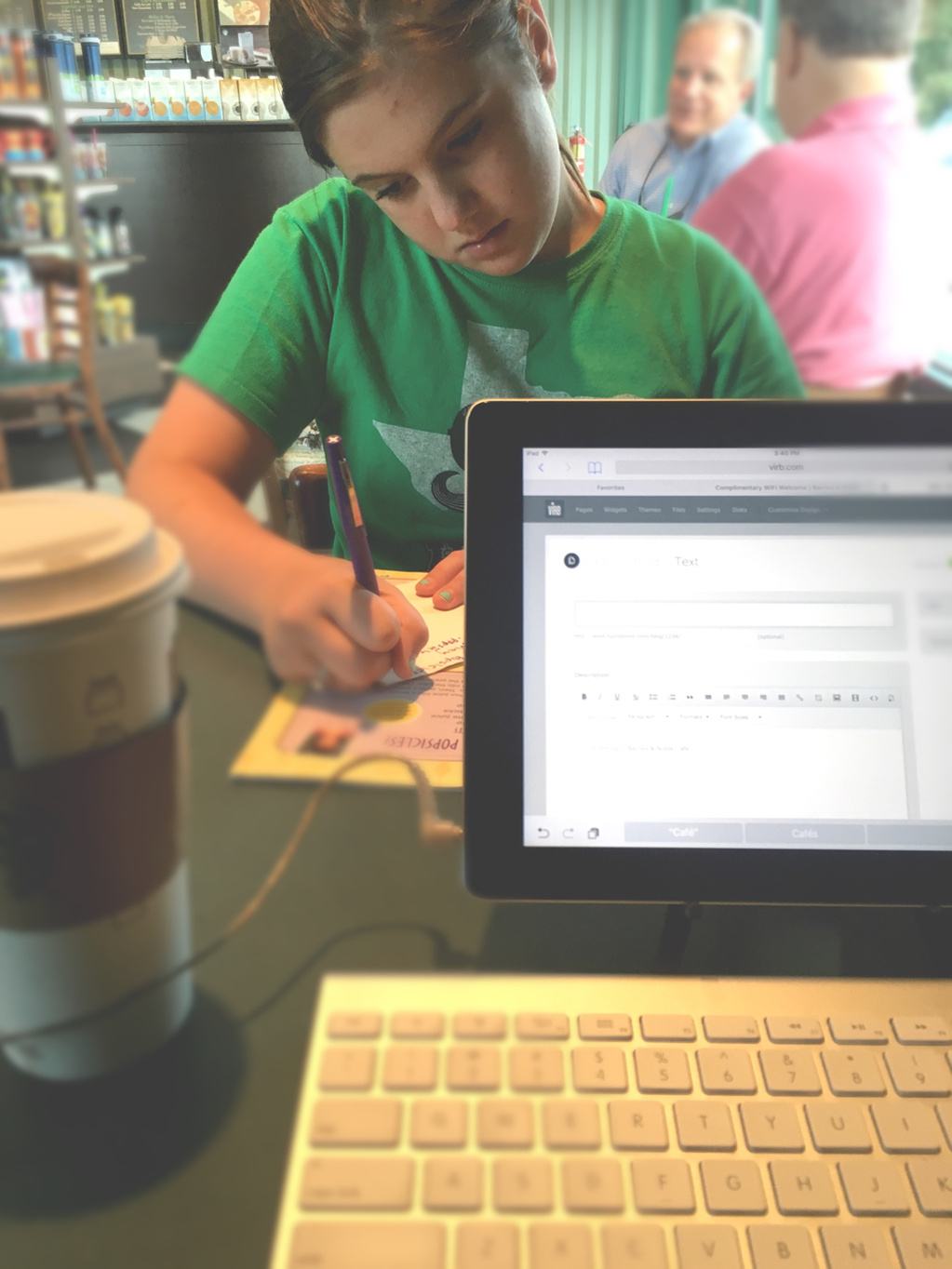
I’m sitting in Barnes & Noble Café with my soon-to-be-5th-grader who is self-entertaining with this month’s edition of Girl’s World while I try to get some work done…i.e. knock out this blog post. This is how a large percentage of our summer days have been spent. (Now that Matty and I are both self-employed, work-from-home, grown-ups.) But the spans of boredom are outweighed by the perks that come from neither of us having a “real job”. Not many families get to have a midday trip to TCBY for Waffle Cone Wednesday, or a quick hike at Paris Mountain, or a bike ride on the Swamp Rabbit Trail, or just simply have lunch together on the front porch, or, or, or, or….
Yes, the trade-off is the security of regular income. Have no fear, friend. I realize this. (The Lord does, too…as He and I have regular conversations about it. LOL)
And, while I love the “looseness” of summertime, I find myself missing the structure that comes with school days. (I’ll deny having said this come October.) School starts in three weeks.
I think we’re going to be okay.
I should probably write about some Fuzzy Bison stuff since that’s more than likely why you’ve landed here. I’ve been working on some logo projects recently with some great clients. I’m going to take the next couple of blog posts to write about each of them as they were all equally fun and rewarding…
- Appalachian Inspections : A home inspections business in Western North Carolina
- Spicy Puppy Studios : A music production conglomerate specializing in audio production for film, television, and worship, with 5.1-7.1 surround sound and spacialization capabilities
- Elberon Amplifiers : An amplifier engineer/builder bringing quality, handmade audio products to musicians and music lovers alike…focused on delivering the best experience through clean designs and superior sound and tone
Thanks for hanging out and check back in soon!
The other day, an ad popped up on my Facebook feed that said…
“Make a Logo in Ten Minutes. Design a Logo Fast & in Real Time. Use Code FACEBOOK for 25% off $24! It’s Fast & Easy!”
I experienced several emotions over the next 20 seconds…
from laughter,
to anger,
to sadness,
to curiosity.
My curiosity won out and I went to TailorBrands.com to generate a logo in ten minutes. It actually took about two minutes (so, you guys should edit your schpeel, Tailor Brands!). While the logo that popped out wasn’t horrible, I couldn’t help but wonder how long it would be until my fictional bagel shop would encounter a competitor in the business who had the same logo generated for their business. (I mean, there were only about ten bagel illustrations that popped up as options for my little faux bagel biz. And only a couple of those were decent enough to maybe possibly consider using as options if I knew how to make a bagel…and had a bagel shop…and didn’t care if my logo of choice was duplicated across the country filled with bagel shops.) See where I’m going here?
Great, effective logos take time. They are the products of hours upon hours of personal research, collaboration, conversation, sketching, compositing, designing, and tweaking. They’ll cost quite a bit more than “25% off $24”, but, take my word, you’ll be happier with the end result and you’ll be spared the potential catastrophe of having “your” logo branded on your competitor’s store front or business card. #ohthetragedy
I need your help with my logo. I paid [insert your-choice-online-logo-generator-website here] $100 for a logo last year, and I don’t like it. I then paid my cousin’s kid who has a graphics app on her iPad to create a logo for me. I’m still not happy with it. Can you help?
I can’t tell you how many times I’ve heard this (or something similar) from clients who come to me looking for help with their logo. I’m thrilled when I hear this because it means several things….
1. They realize what isn’t going to work. They may have had to drive down a bumpy road to realize this, but now…they get it. Clients who get it are the most fun to work with.
2. They realize the blood, sweat, and tears they pour into their business is deserving of a logo that reflects their efforts. It’s mind-blowing to me that folks expect to pay $100 for a logo that is, most often times, the very first impression of their business to potential clients. I was recently listening to a podcast interview (by William Matthews) with John Mark McMillan. He made a reference to the quote, “The medium is the message”, by the Canadian philosopher, Marshall McLuhan. JMM said “The way you say something is what you’re saying.” Yes! I was just discussing this with a client the other day. A half-assed executed logo says to your client/customers, “Yo, check out my half-assed business. It’s not great. It’s just ok and I really don’t put a lot of thought into it. But please, come on in and let me see what I can do for you!” I don’t think I need to expound any further on how much sense this doesn’t make for someone who is serious about their business and the customers they service.
3. It’s yet another case for proving that logo generating sites suck and are ruining the art-form that I, along with my designer cohorts take much pride in. Nah, I’m kidding. They don’t suck. But they definitely aren’t the solution for everybody. I’ve thought long and hard about this and I’m not so cocky to think that my method (and the countless droves of other seasoned graphic designers’ methods) of logo development is the only way for everybody. It’s not. Just like a 2016 BMW i8 isn’t for everybody. Some people only need a 1985 Yugo to help them carry out their daily responsibilities. And some people might need a 2014 Honda Accord. I’m not being facetious, here. No, really. I’m not. Warren Buffet isn’t going to hire Fuzzy Bison to develop the next identity for his bazillion dollar project. He’ll hit up Pentagram or Wieden + Kennedy to knock that out for him. I’m not on his radar…and neither is 99designs or [insert your-choice-online-logo-generator-website here]. I do believe, however, that those generator sites can confuse and displease those who have no clue about logo design and what all it entails. It can leave them severely dissatisfied and yearning for something more. But, that’s okay, because even though they’ve lost a hundred bucks or so, they’ve now been educated about logo design. And hopefully they realize that unless you’re little Johnny Jenkins running the lemonade stand up the street, or Deb Bradshaw going door-to-door selling boondoggle keychains, then you’re probably going to need something other than a logo generator to create an identity for your business.
I’m going to take the next couple of blog posts to continue down this talk of logos. Hang with me. And thanks for hanging out.
fuzzy-bison-graphic-design
fuzzy-bison
logo-design
99-designs
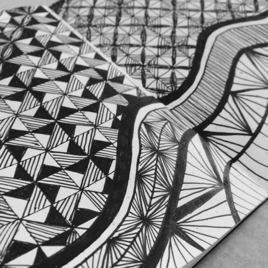
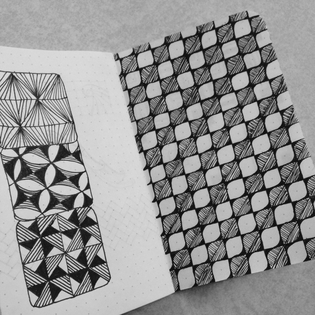
I ordered a book last Fall called One Zentangle A Day (Here’s what a zentangle is, incase you aren’t familiar….Zentangle) One zentangle a day was a bit of an overachievement for me, so I made a 2015 goal to do one Zentangle a week. Yeah, I can do that.
Wrong.
(It was April before I attempted my first one.)
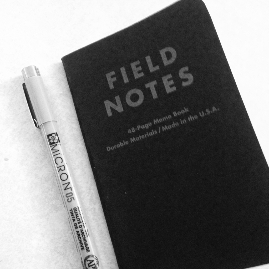
Matty even got me a bristol board pad, Micron pens, and Field Notes graphed books for Christmas to help me get started. I had everything I needed.
Everything except for…well, there’s this little issue I have had am working on that I talked about in this post.
I’ll not rehash all of that again, but let’s just sum it up by saying that I have a problem starting projects that I know I can’t take the time to make perfect.
But…heck. This is doodling. It’s just doodling. It’s not supposed to be perfect. (But look…look at that blank bristol board. You can’t mess that up, right? You should doodle in pencil first. Then, go back with your Microns. What? No, that’s stupid! It’s frickin’ doodling. It’s not the Sistine Chapel, you idiot!)
A couple of weeks ago, Matty had a meeting in Charleston. So, like any good wifey would do, I felt like I should go with him. (When Charleston calls, one must go.) It was a great little overnighter getaway. I had lots of time to tidy up email, check up on clients, and…
Finally do some doodlin’.
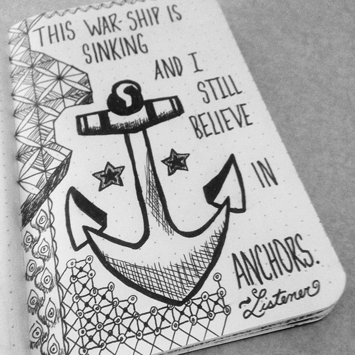
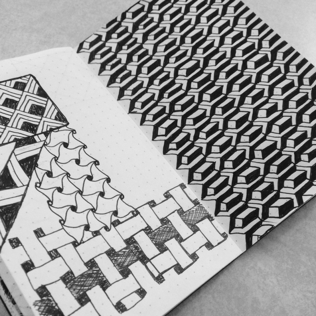
I had so much fun. Oddly enough, I was by myself the majority of the time. I filled up several pages with zentangles. I cringed when I messed up, tore pages out, and scribbled a lot…but it was still a super great time for me. Sometimes, a big ol’ chunk of creative alone time is good for the soul.
It’s hard to carve out time to just let our minds go and not really think about all the things that we constantly have happening. But, it’s so important to do that. In my line o’ work, finding ways to be creative away from the glow of the iMac is crucial for me. It enables me to be creative when I am sitting at the iMac. It’s imperative. I’m starting to realize that more and more…and finding fun ways to do that.
Take time to chill out. Take time to be creative. Take time to be alone. Everyone will thank you for it…especially yourself.
doodling
zentangles
field-notes
micron
fuzzy-bison
fuzzy-bison-design
This past week has been super exciting for the Carter fam. My paw-in-law, whom I affectionately call “Ralphie” or “Ralpho” (Dr. Ralph F. Carter, Jr. is just too formal for me…and it doesn’t fit him either, so I took the liberty to change it) had his first published book go to press! Official release date is May 27.
Insert shameless plug here —> Preorder yours today!
He’s been hard at work for so long on this, so it’s been fun to watch the excitement build as he’s worked with his publisher over the past several months. All the tough moments are over and it’s time to just sit back and hopefully sell the crap out of some books. <—That’s pure marketing jargon there. Don’t be fooled.
Ralph is the most honest, humble, and selfless person I have ever known. He’s the real deal. He has a big pastor job at a big Southern Baptist church, but he’s not that…or what you would envision that to be, rather. I’m so blessed that he’s my paw-in-law and Scout’s “Papa”.
He’s an incredibly committed person. If he says he’s going to do something, he’ll do it.
He said he was going to write a book.
He wrote it.
Done, son.
What are you putting off that you keep saying you will do? Is there a project you keep saying you want to start? Is there a place you want to move to? Is there a career change you want to make? Is there a person you want to marry? Is there a book you want to write? Do it. Go there. Make it. Ask them. Write it.
Life is too short to put off whatever it is you keep saying you are going to do. Ralph lost his mother around this time last year. She was diagnosed with myeloma in December and was gone by June. It sucked. It really sucked. And it reiterated so loudly what we already knew to be true. Life is short. Treat those you love like you won’t see them tomorrow. And do those things today that you want/need to do…because you might not be here tomorrow to do them.
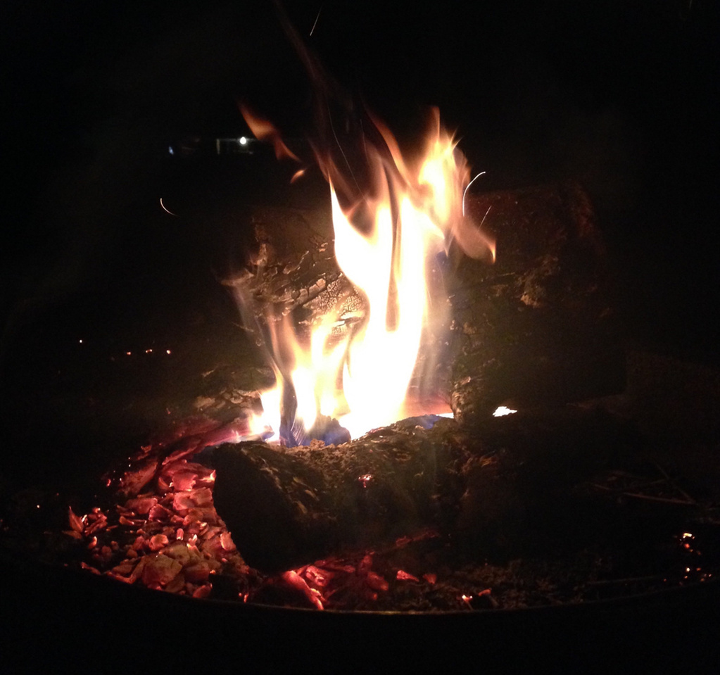
I came outside tonight to finally start reading a book that I ordered, ohhhh, about two years ago. I was so excited to get it, but I knew, as is true with every book I pick up, it would take me forever to finish it. Fast forward two years to me sitting in the backyard tonight by the fire. Not only have I not finished the book, I haven’t even started it. What is wrong with me?!
I sat down tonight to read, and as I finished the first chapter, dusk turned to darkness and every tree frog within a five-mile radius of our backyard started their Call o’ the Wild. Nearly simultaneously, the neighbor’s dog started barking, the other neighbor’s dog started barking, the crickets started chirping, some other bug choir was making a screaming sound, and my fire was dying out. I’m SO distracted by the slightest thing if a task demands my concentration. I tried to battle through it, but I kept reading the same paragraph over and over and over (I can’t tell you how many times I have done this in all the books I’ve read in my lifetime.) So I closed the book and started writing.
Let’s see how this goes.
I was sharing this week with a friend that I have this struggle with starting things. (Although, I don’t think it really relates to my failure to start a book, but it feels like a good place to share this as it does relate to my previous post about the cornhole boards. And, I also can’t read my book right now anyways because it still sounds like I’m hanging out in a jungle with a couple of random stray dogs. And, I gave up on stoking my fire. Poof. It is no more. So, I may as well just write this blog.)
I was telling my friend about this Start-Struggle I have as it relates to personal projects (Not so much in my livelihood, praise the Lord. That would pose a problem, huh?). It’s a by-product of my struggle with perfectionism. I don’t do lots of things that I want to do because I know I can’t or don’t have time to do whatever-it-is exactly the way I want to. So I just don’t do it. I think about doing it and know it would be great to do, but I just can’t bring myself to do it because I know it won’t be done at the level that I expect from myself. This is an obviously an issue. I miss out on a lot of fun things and procrastinate a lot of fun things. Finishing the cornhole boards was a big step for me working through that. Now…honestly…every time I look at them, I see 90 things that I wish I would’ve done differently, or better. But, I’m fine with them and happy I completed them. And even more happy that I started them.
I’m increasingly aware of this and I know the only way to fix it is to continue to force myself to start stuff…even though I know I won’t be able to make it perfect.
It’s finding that balance.
And realizing that I need the balance.
(And going inside before these tree frogs and dogs drive me batty.)
Good night and thanks for sticking around and reading this lament, of sorts. 😄
distracted
start-struggle
perfectionism
personal-projects
failure-to-launch
fuzzy-bison
fuzzy-bison-design
I started this personal project, of sorts, back in August. I finished it today. I’m so glad I finished it today. I’m not horrible about starting things and not finishing them, but sometimes that creeps in. Especially if it’s just something for fun…you know, like a personal project.
Last summer, I worked a brief, full-time stint at Upward Sports in Spartanburg, SC. Upward has an affinity toward, well, sports…makes sense, huh? So, when the annual cornhole tournament rolls around in June, it sends quite the buzz through the office and everyone is completely stoked. I had never played in the cornhole tourney because it was only for full-time employees. Not contract workers. Well, my status at this brief point in time was “full-time employee”, so I was IN this year. I never really played cornhole much. I thought it was fun, but I was pretty horrible at it.
So, me and my buddy, Erin, worked on our “game” during most every break and sometimes lunch. It was such a great way to enjoy the sun and blow off a little steam after sitting in Cubical-Land for eight hours a day. And after a while, we began getting halfway decent at it and started talking about how easy (and possibly fun) it could be to make our own boards.
Erin and her hubs, Phillip, make all sorts of things. Carla and her hubs, Matt, talk about making things, but never execute the plan because, well, they know that their time and energy would most likely be better spent by just purchasing said thing. Being “handy” is not a specialty in the Carter household. But, since Erin and Phillip are handy, we were thrilled to partner up and at least fund the project and offer moral support… and maybe even pick up a drill. So, after an evening spent in the Patton basement, a couple of Domino’s pizzas, some hard labor by Phillip, some spectating/half-assistance by Matt, 100% spectating from Erin and I…we had a set of cornhole boards! (Thank you, Phillip!) :-)
With two bare boards calling out for some color, I began brainstorming about what I could possibly put on them. This took a while, so in the meantime, Erin crafted some cornbags…overnight. Yeah, overnight. How she does this, I’ll never know, but I greatly admire her tenacity for completing tasks. She showed up at work the next morning with four gray bags and four teal bags…filled with the perfect amount of corn, all sewed up, and ready for play. (At this point, Phillip had already made another set of boards for the Patton household…ahhhhhmazing.)
Now back to brainstorming…
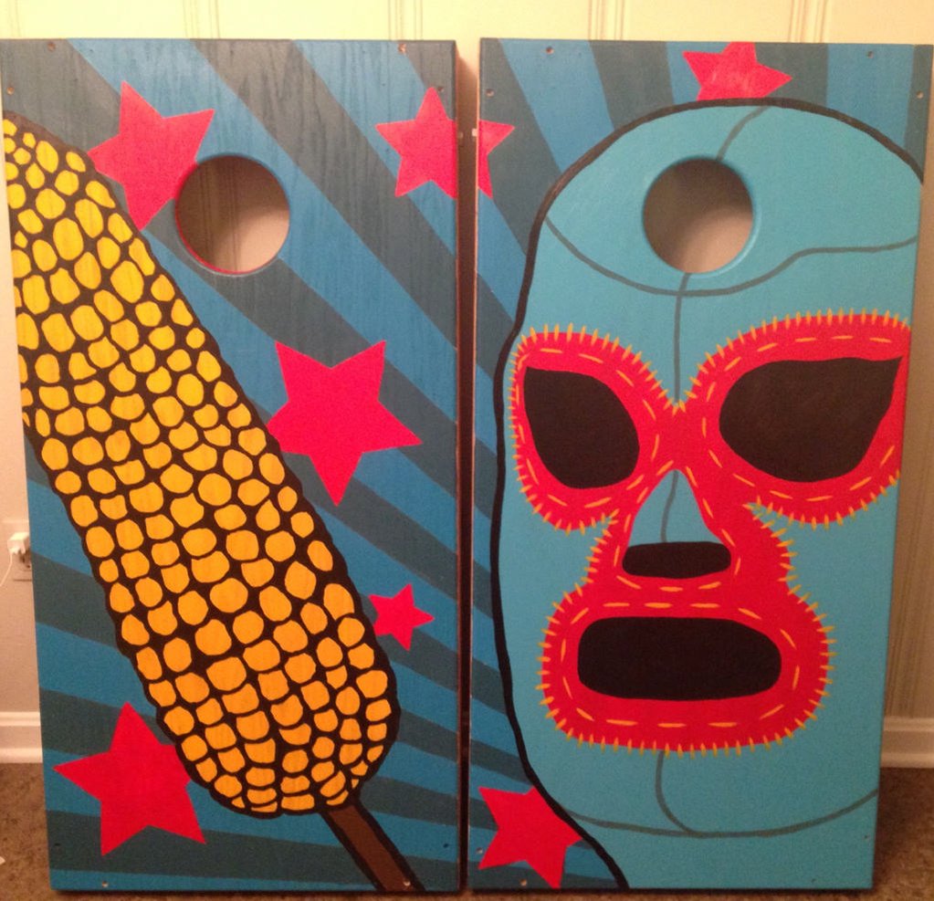
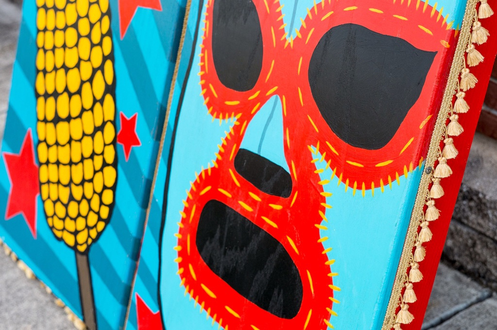
If you’ve known Matt and I for any amount of time, you know that we have quite an affinity toward any-and-everything Mexican…culture, colors, food, people, food, tradition, food. (We had tacos and enchiladas for our rehearsal dinner.) Yes, it’s true love. So, the brainstorming ended when this one phrase from a favorite flick came to mind…“Get that corn outta my face!”
Nacho.
Libre.
Cornhole.
Boards.
Voila! This is it!
Now, stop reading this right now if you haven’t seen Nacho Libre and GO. WATCH. IT. You can thank me later.
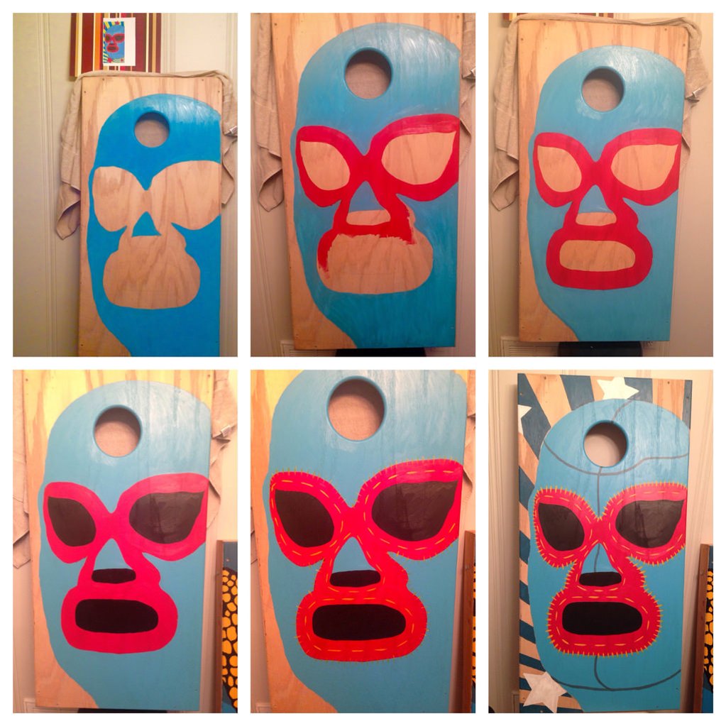
I started by laying the design out in Illustrator and figuring out the dimensions and how everything would position on the boards. I’m not an illustrator, so I found the best Nacho Libre mask image I could find, laid it on the artboard, and drew a vector image over it on a different layer (aka digital manual tracing..haha). I did the same with the corn. And then I just did a sunburst with some stars for the background. The next step was to print it out and then use the ol’ trusty projector to get a good outline going on the boards. This would be simple if I had a decent projector, but it’s pretty horrible, so I’ll spare you all of the grunting and groaning I did for the next several hours as I tried to get a pencil outline for some basic framework. I didn’t take a picture of this step of the process. I guess because I didn’t want to remember it. Ha!
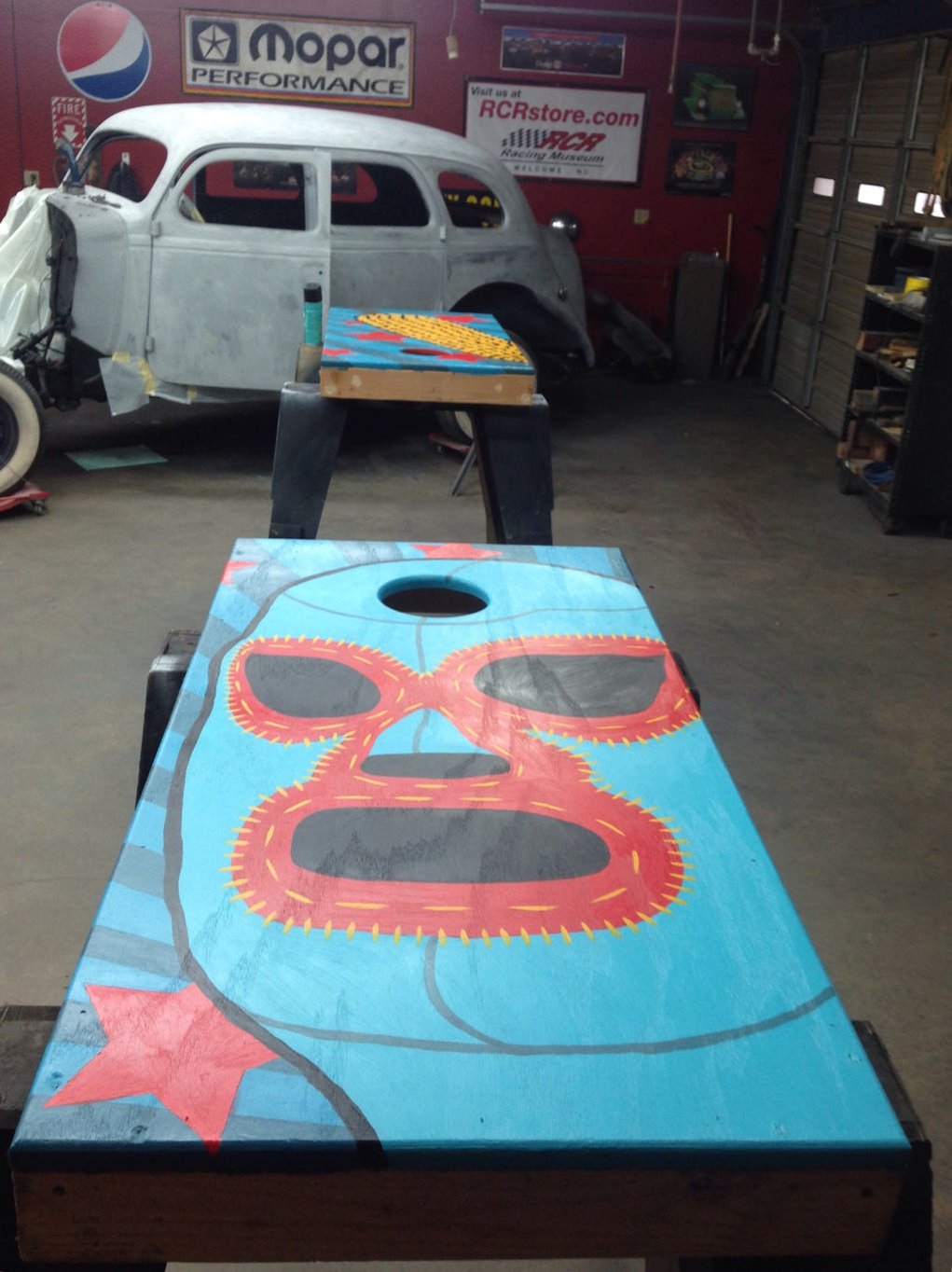
Here’s a progression of how I laid down the mask board. At this point, I already finished the board with the “corn-on-a-stick”. I never think to take progress photos until the process is over, so I was glad I at least remembered to start taking them at this point. In the first image, you can see my vector image propped up top. And you’ll also see later that I didn’t stick with my original plan. Ha!
So at this point, the fun painting part was over.
The next step was to take them over to my dad’s shop and get some poly coats on them. Dad’s quite the master with a spray can, so he helped me get it coated up real nice. (He has a pretty sweet project going on himself…see it back there?)
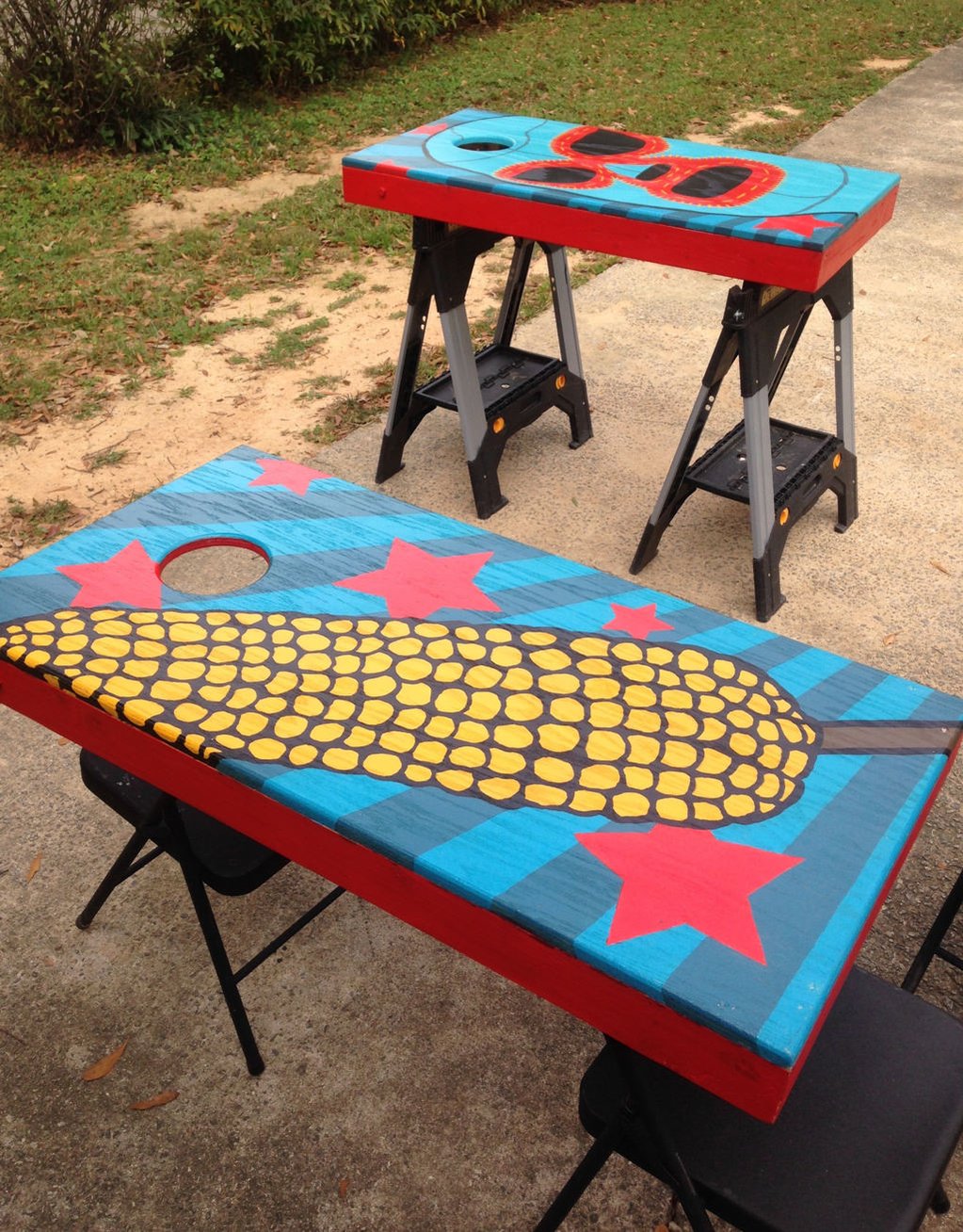
Painting the sides. Not real exciting.
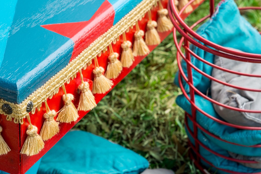
And now for the finishing touch…the ultimate Nacho-touch. What would Nacho cornhole boards be without a little touch of gold tassle fringe?? Right. My thoughts exactly.
Perfecto.
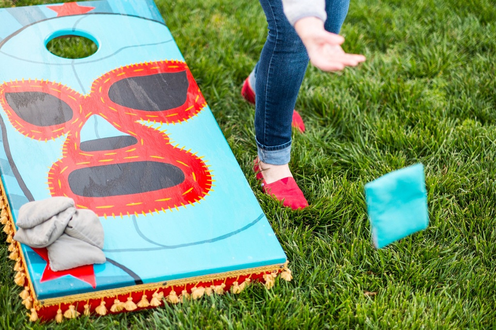
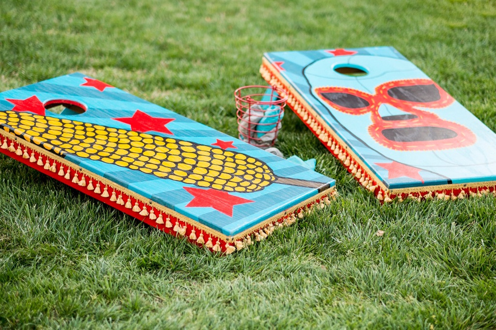
Up to this point (except for the fringe photo), I had just snapped photos with my phone. So I really wanted Matt to shoot some with his mad skillz. Our grass is pretty janky and not yet green, so after trying to shoot them there and not having good results, we loaded up early the next morning and headed up to our church yard for some pretty grass back-droppage. We got there super early to catch the “magic hour”. It was great. Cold, but great. I love the images he captured. Thank you, Matty.
Ironically, the bags Erin made (before Nacho was even thought of), ended up being the perfect colors. The chicken egg basket also ended up being the perfect container for the bags.
I’m in love with these colors.
My first cornhole modeling gig.
So, they’re done and I couldn’t be happier with them.
Now…
“Get that corn outta my face!”
nacho-libre
jack-black
cornhole
mexicorn
handpainted
custom-cornhole-boards
handpainted-cornhole-boards
personal-project
fuzzy-bison-design
fuzzy-bison
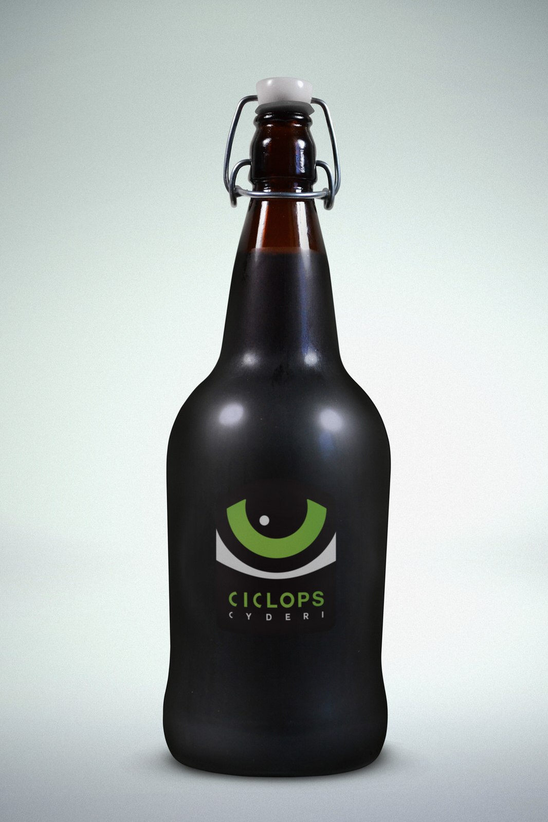
I’ve been working on some really fun stuff the past several months. Back in October, a fellow graphic design buddy of mine, tossed a client my way that he didn’t have time to pick up. (Those are great buddies to have, btw. Thanks CT!) This job was for Ciclops Cyderi out of Spartanburg. Ciclops Cyderi is unique in their use of world-wide flavors and traditional, ancient, and unconventional cider brewing techniques. Kolby (the owner and all-around-fun-bearded guy) was certain of what he wanted in a logo, we just needed to make it handsome and function as he needed. So the gist of the idea was an eyeball in a box shape (there’s more to it than that, but I’ll save you all of those details since I’m just happy that you are still reading this).
So here we have a Ciclops Cyderi growler with it’s new fancy-pants logo. Yay!
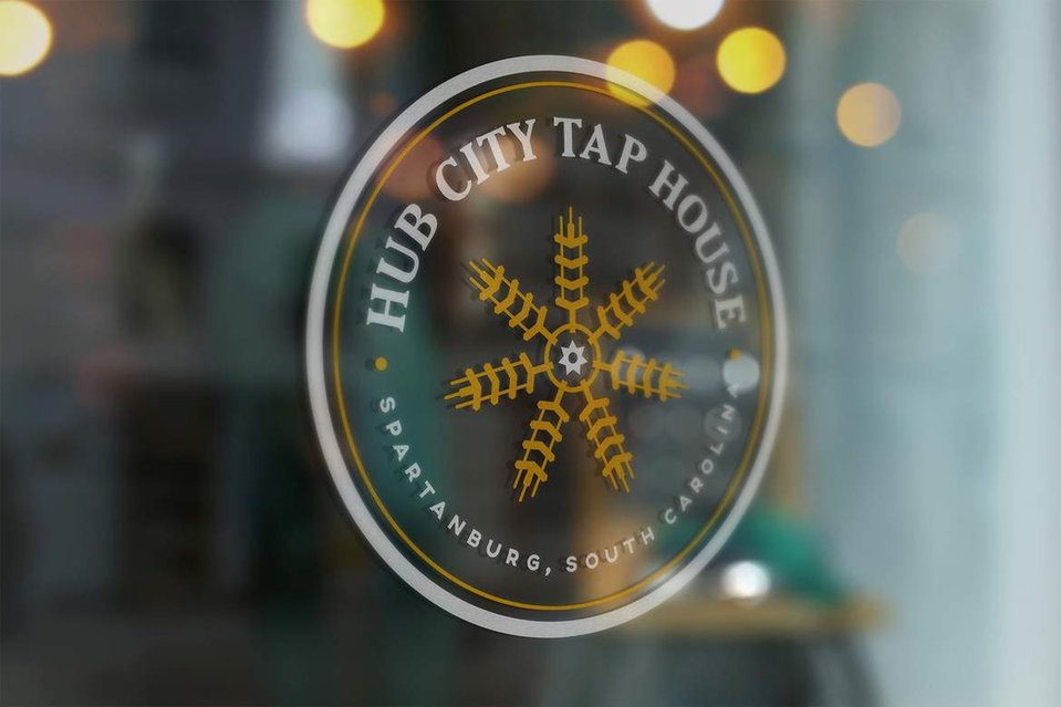
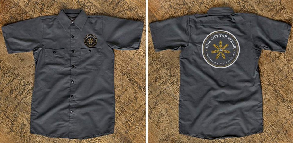
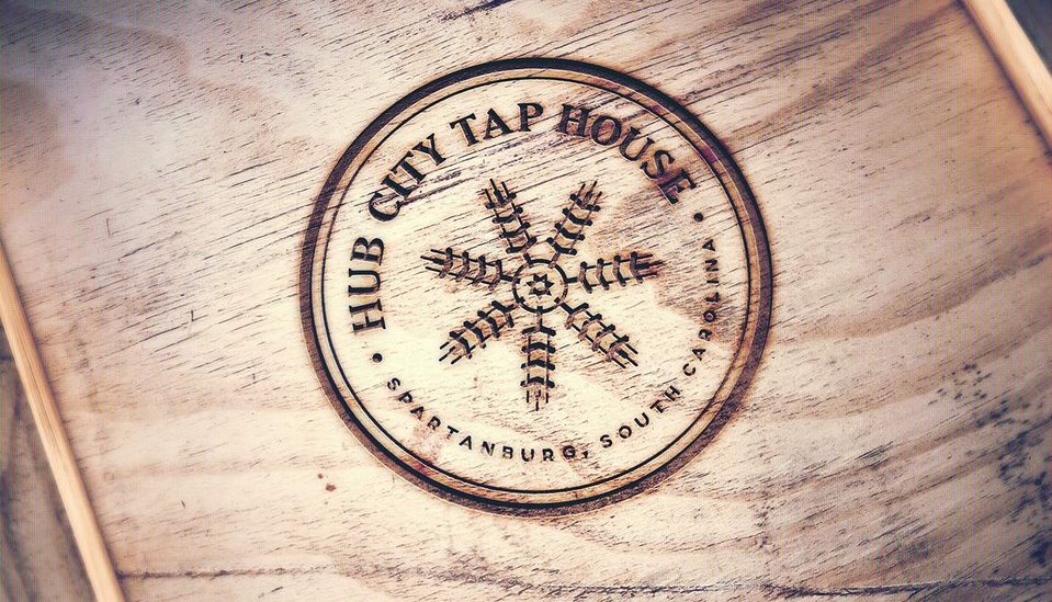
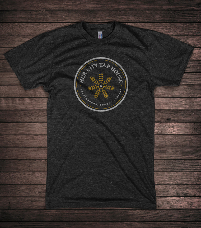
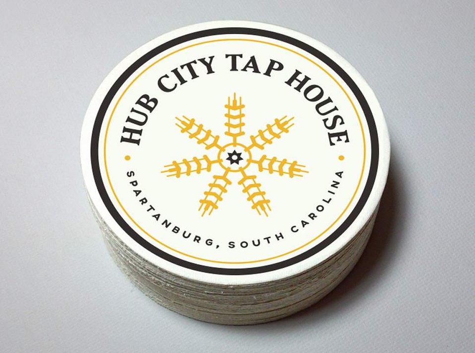
So after knocking this out for Kolby, he asked if I would work with he and his business partner, Michael, on reworking the logo they had for their upcoming business, Hub City Tap House. Of course, I said yes. I begin every logo project with a logo questionnaire for my clients, so Michael filled that out and off we went. He was open to anything, but was envisioning something with textures that would be reflective of the interior vibe of the Tap House…corrugated metal, wood, brick, industrial feels. He had also been studying English pubs and thought the reverse glass decoration and ornate gilding of that era was interesting. (Think John Mayer’s Born & Raised cover…by David A. Smith) He wasn’t sold on any of this, but was just tossing ideas around. So we have lots of highly detailed interesting stuff going on here. When it comes to logos, simplicity is going to be your bestest friend. So, I began trying to think…what if, instead of reiterating the interior textures/vibe, what if we complimented them instead with a logo with stylized industrial elements (straight hard lines, symmetry, encasements). I contacted Michael to let him know what I was thinking and he was totally supportive.
So Why “Hub City Tap House”? Of course, it’s Spartanburg’s long-lived nickname. It’s also what a large percentage of Spartanburg businessmen/women choose to name their babies. But why? I don’t know about all of the other Hub City Fill-in-the-Blank businesses, but I know for Kolby and Michael that they are eager to become a part of the community. They want to give back. To open arms and say “We’re here. We want to serve you. We want to give back. Now, come on in and have a beer.”
(Here are some excerpts of the logo presentation. This will be easier than just typing all of this out, because like I already said, writing isn’t necessarily fun to me. Although, I’m having an ok time right now, I guess. Ha!)
So, that was that. I then show that the logo can work in various ways…one-color, two-color, three-color. I also love giving a logo “life” in a presentation so that my clients can see how it will actually look when they use it. It’s great that a logo looks good on a white background in a pdf document, but that’s not where it’s going to live most of it’s life.
So here are some of the mock-ups I used to show how it could “live”:
The response from Michael was great and I couldn’t have been more thrilled that they were thrilled.
“I’m blown away. Seriously. This is phenomenal. Thank you so much! I’m almost speechless. I’m not sure what else to say. Wow.”
logo-design
tap-house
hub-city
hub-city-tap-house
spartanburg
south-carolina
spartanburg-sc
michael-wilcox
kolby-garrison
ciclops-cyderi
brewery
cidery
cider
craft-beer
fuzzy-bison-design
fuzzy-bison
craft-brewery